by Robert Garcia
Soon we will begin to see a few campaign ads and posters, and soon after that they will be everywhere.
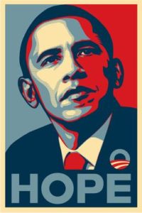
The modern campaign ad or poster is a slick thing, with Facebook- or Twitter-tested taglines or slogans and occasionally colorful trendsetting design. It’s nothing like its early forebears. As an element of political pop culture, the campaign poster has taken a long road to its present form.
In earlier times of campaign advertising the ads and posters were positive, informative, even charming.
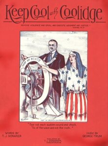 1924: Calvin Coolidge (Republican) v. John Davis (Democrat) v. Robert La Follette (Progressive)
John Quincy Adams was the first presidential candidate to widely use posters in 1824, according to the Miller Center at the University of Virginia, but the oldest American campaign poster in the Library of Congress’s digital file was issued by presidential candidate William Henry Harrison in 1840.
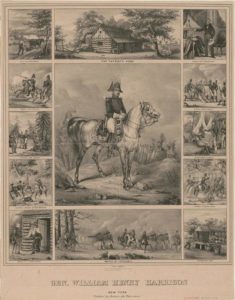 William Henry Harrison in 1840.
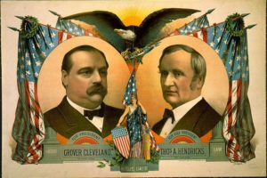
In the 1800s, posters were far more detailed than they are today. Early campaign posters featured etched portraits of the candidates looking statesmanly, even regal, and were printed using the print technology of the day, sometimes inked in color. Extensive text was sometimes included with the portraits, and in some instances the text was the poster’s main feature.
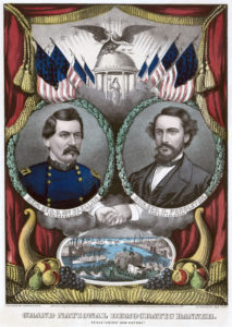 1860: Abraham Lincoln (Republican) v. George B. McClellan (Democrat)
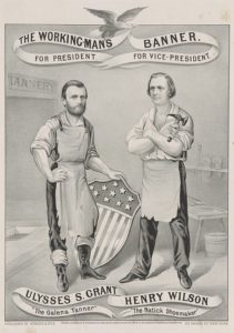 1872: Ulysses S. Grant (Republican) v. Horace Greeley (Liberal Republican)
Steven Heller, a design expert and former New York Times art director, commented that it was harder to reproduce images than to reproduce text. They wanted to inform the public, and the public even then was fairly literate, so there was more of an emphasis on the written or printed word. Later into the 19th century as technology advanced, it became easier to reproduce things with wood or steel engravings. But by the end of the century, the camera had become more popular. Photos of candidates Ulysses S. Grant and Abraham Lincoln routinely appeared on posters during their campaigns.
By the middle of the 20th century, a new design scheme became very popular—black-and-white photography with color backgrounds and large, easier to see and read text. Big, block-letter slogans and candidate names replaced the lengthy cursive script seen in the etched prints of the late 1800s, and bright primary colors replaced their dusty olives, sepias, and sun-yellows.
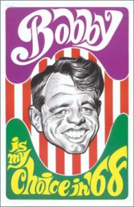 1968: Richard M. Nixon (Republican) v. Hubert Humphrey (Democrat) v. George Wallace (Independent)
Offset printing became popular for commercial printing in the 1950s, and color photographs, along with full color layouts, supplanted black-and-white by the time Richard Nixon ran for president in 1972.
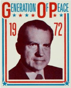 1972: President Richard M. Nixon (Republican) v. Senator George McGovern (Democrat)
While candidates are now able to mass-produce color-photography posters in every election year, printing advancements haven’t necessarily made campaign posters more complex. The most widespread style, to this day, is the block-lettered rectangle using only the candidate’s last name and maybe a brief slogan or tagline. These signs hang on countless walls and populate countless front yards every couple of years.
This tells us printing capabilities don’t necessarily change the design imperative. Simplicity is what seems to be practiced most often.
Other technologies may have helped to popularize the simplistic design formula. With mass electronic media, candidates choose not to deliver platform information through posters, and the long scripts and etched portraits of the late 1800s would now look ridiculous. TV commercials and social media have taken over the function of higher-level messaging and image creation.
Today, the posters just remind us simply of what the candidates’ names are. Aesthetics and mnemonics are left mostly to computer generated art, font, and color scheme.
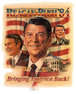 1984: Ronald Reagan (Republican) v. Walter Mondale (Democrat)

